LEAP Summer School: Free CRO course worth €3,000!
Sign up for free

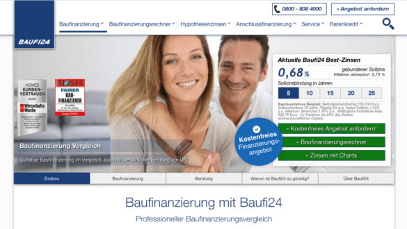
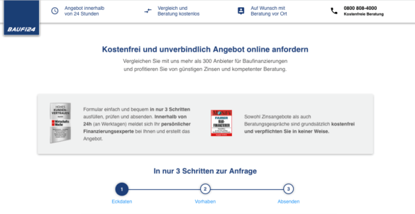
Forms are the inconspicuous but most critical part of every customer journey. Regardless of whether the purchase, lead generation or newsletter sign-up — this is where it is decided whether the expensive purchased traffic actually brings in revenue or whether interested parties jump off just before the conversion. In 2025, it's more true than ever: A good form is not a nice-to-have, but a business lever. By combining clarity, trust and usability, you reduce bounce rates and increase conversion rates, customer lifetime value and ROI at the same time.
1. What principles characterize successful forms
2. Which 10 specific adjustments will help you to reduce abortions and guide users to the end
3. How to systematically test and optimize forms to generate measurable growth from every form field
1. What principles characterize successful forms
2. Which 10 specific adjustments will help you to reduce abortions and guide users to the end
3. How to systematically test and optimize forms to generate measurable growth from every form field
The reality is harsh: Even minor frictions such as unnecessary fields, unclear error messages or a weak call-to-action lead to abortions. Each individual abandonment means lost sales, unused leads and increasing costs per acquisition. The following tips will help you improve your KPIs and unlock the untapped potential of your forms.
A common reason for cancellations in forms is uncertainty. Users often don't know whether their input is correct, or they only notice errors at the very end of the process. This leads to frustration — and, in the worst case, to an abortion just before the conversion.
Instead of only issuing an error message after submission, your form should verify entries in real time. If the user enters an incorrect email address, they must immediately receive clear feedback — not just on the confirmation page.
Positive confirmation: creating small experiences of success
Not only should errors be displayed immediately, but correct entries also deserve feedback. Checkmarks, green marks or small confirmation texts (“Everything correct! “) ensure that users remain motivated.
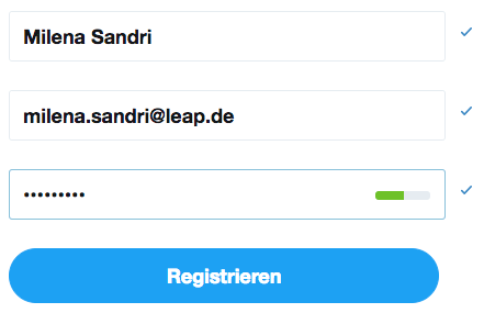
Checkmarks confirm the user's entries
Mobile relevance
Especially on smartphones, where inputs are more cumbersome, inline validation is crucial. Errors at the end of the form almost always mean immediate termination. Instant feedback keeps users in flow and increases mobile conversions.
Conclusion: Inline validation and positive confirmation are not nice extras, but central conversion levers. They reduce dropouts, increase satisfaction, and make the path to closure clearer and easier.
Trust is the all-important factor, especially when it comes to checkout or forms with sensitive data (e.g. address, payment information, telephone number). Users think carefully about revealing their data — and even small doubts can prevent them from sending.
Well-known seals of approval (e.g. TÜV, Trusted Shops, eKomi) or security indicators such as SSL encryption act as a psychological shield. They show: “My data is safe here. ”
Benefit communication directly on the form
Users subconsciously ask themselves: “Why should I fill out this form anyway? ” — This is exactly where benefit communication comes into play.
These points will further motivate the user to convert.
This not only alleviates concerns, but also creates additional purchase incentives. By clearly emphasizing the benefits and mitigating potential risks, you reverse the decision logic: The user has nothing to lose, but something to gain.
Mobile features
Space is scarce on small screens. Trust seals and benefit communication must therefore be placed particularly prominently and concisely — in the direct field of vision, without scrolling.
Trust is the currency in the form process. Anyone who visibly communicates security and benefits increases the willingness to enter sensitive data — and directly increases the conversion rate.
People are guided by the behavior of others — especially when they are uncertain. Forms are just such a moment: “Is it really worth signing up? ”, “Can I trust this site? “This is where the social proof effect comes in.
Forms of social proof in the form context:
Social proof reduces cognitive dissonance. The user thinks: “If so many others have already done it, it is certainly the right thing to do. ” This social support is crucial, especially in the last step before conversion.
Practical examples:

Reviews and bookings made today on a booking portal
Use on mobile
Short, visually clear elements work best: star ratings, compact figures, or well-known brand logos. Too much text can quickly become overloaded. Social proof is the turbo booster for trust and motivation. In combination with trust seals and benefit communication, skeptical users become convinced customers.
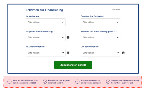
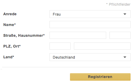
A good form depends on clarity and consistency. Users want to see at first glance which information is really required, how the fields are structured and how much effort they can expect. Confusing structures, on the other hand, create uncertainty and frustration — a common reason for interruptions.
Dealing with mandatory fields is particularly important. Too much mandatory information is a deterrent and makes the form appear unnecessarily complex. Companies should therefore only request the information that is essential for the respective step. A clear identification of the mandatory fields — for example with uniform symbols or a brief explanation — also helps to avoid misunderstandings.
The visual structure also plays a major role. Uniform formatting with clear columns and logical groupings gives the form peace of mind and readability. When users constantly have to jump between different areas with their eyes or fields are unevenly distributed, stress is unconsciously created. A clean, linear arrangement, on the other hand, provides control and overview.
Unfortunately, not all forms are so clear
Last but not least, the number of fields also determines success. Studies have been showing for years: Each additional field reduces the probability that a form will be completed completely. Everything that is not necessarily needed immediately should therefore be stored downstream or optionally queried. A slim structure is particularly mobile, as long forms quickly act as a deterrent on small displays.
In the end, fewer fields, clear labeling and consistent formatting turn a potential conversion killer into a trustworthy and efficient tool — and ensure that users actually take the last step.
At the end of every form, there is the decisive moment: the click on the call-to-action. This button is more than just a technical element — it is the last hurdle between bounce and conversion. All the more important that it immediately catches the eye and is clearly understandable.
A CTA should visually stand out from the rest of the form. Color, size, and placement must ensure that it cannot be overlooked. The wording is just as important: A simple “send” appears anonymous and interchangeable, while an active “test now for free” or “secure offer” concretizes and motivates the action. Users want to know exactly what happens after the click — this creates security.
In a mobile-first context in particular, the CTA plays an even bigger role: There is often little space left on small displays, so that it must be clearly and prominently highlighted. Anyone who works here imprecisely or unobtrusively risks that even interested users will abort in the last step.
Small words, big impact: Microcopy — i.e. short text elements in and around form fields — can make the difference between users understanding the process or giving up in frustration. Examples include notes on password requirements, explanations of mandatory fields, or ghost text directly in the input field.
But beware: Ghost text is often misused. If it simply repeats the field name (“enter name”), it doesn't add value, but rather confuses — especially when the text disappears when typing and users no longer know what was originally required. On the other hand, it is useful when it addresses uncertainties: for example, when it comes to correct telephone number formatting or when it comes to information about the card verification number.

Not all Ghost text is really helpful
Microcopy works best when it's accurate, empathetic, and unobtrusive. A friendly note (“We only ask for your phone number in case of questions”) can build trust, while clear examples (“MM/YY for expiration date”) prevent unnecessary errors.
As a result, Microcopy reduces cognitive load, provides orientation and lowers the likelihood that users will drop out of frustration. Especially in combination with inline validation, it ensures that the form flow remains easy and understandable.
Forms often look like a black box: Users don't know how many steps they still have ahead of them or when the goal has been achieved. This is exactly where a progress bar comes in. It visualizes the path through the form or the entire checkout and thus reduces uncertainty.
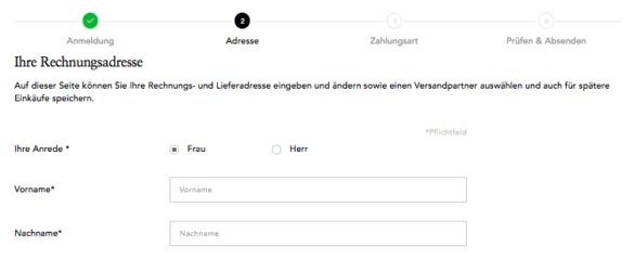
This way, the user knows how many more steps are required of him
Psychologically, this is where the Endowed-progress effect on: Anyone who is visibly aware of their own progress remains more motivated and is more willing to complete the process. Even a simple bar with stages such as “Address — Payment — Confirmation” provides orientation and provides transparency. Users feel less delivered and more actively managed.
This is particularly important in the mobile environment: Small screens quickly make long processes seem overwhelming. A progress bar takes the weight off and breaks down the path into manageable steps. This creates flow instead of frustration — and increases the likelihood that users will stick around until the last click.
A good form is like a clear tunnel: At the entrance, the user enters with an intention — at the end, there is the conversion. Anything that distracts along the way jeopardizes this degree.
That's why: No unnecessary navigation options in the checkout. Main menus, external links, or eye-catching cross-selling elements can distract attention from the actual destination and provoke exits. Instead, the funnel should be designed so that the focus is solely on the task: filling out and completing the form.
Tunneling doesn't mean patronizing users. It is more about reducing friction and keeping mental effort as low as possible. In addition, trust elements such as security seals or a brief benefit communication can be installed — but only in places that encourage, not distract, the user.
Here, the user is not yet in the funnel and has all options
Here he is in the funnel and is no longer distracted by navigation
Studies show that even removing the main navigation in the checkout measurably increases conversions. Users have to make fewer decisions and stay in the flow. In this way, the tunnel is not a compulsory corridor, but a clear, pleasant abbreviation to the destination.
An optimized form is not an end state, but an ongoing process. User behavior is changing, technical standards continue to develop, and legal frameworks — keyword data protection or accessibility — are following suit. Anyone who reworks forms once and then puts them “on autopilot” is wasting potential and risking the conversion rate gradually falling again.
Continuous testing is the key. Even small changes to label texts, button formulations or field arrangements can have noticeable effects on the completion rate. Instead of carrying out major relaunches at long intervals, an iterative approach is more efficient: formulate a hypothesis, test the variant, evaluate the results — and immediately incorporate the learnings into the next optimization.
Particularly effective:
Testing is not only a conversion lever, but also risk management. Instead of relying on gut feeling, clean tests provide reliable data that you use to objectify internal discussions and validate your decisions economically.
Companies that continuously test and optimize forms are not only sustainably increasing their conversion rates. They also reduce interruptions, improve data quality and build a data-driven optimization culture that goes far beyond individual forms.
Forms are not only UX elements, but also a sensitive point of contact with legal frameworks. Anyone who makes mistakes here not only loses users, but also risks fines, warnings and image damage. Two regulations are particularly decisive for 2025: the GDPR And the new Accessibility Strengthening Act (BFSG).
The General Data Protection Regulation has been in force since 2018. For forms, this means:
A form that requests superfluous or unclear entries thus violates twice: It lowers the conversion rate and violates applicable law.
BFSG: Accessibility as standard
From June 2025, the Accessibility Strengthening Act comes into force. Digital services in the EU must be barrier-free from then on. For forms, this specifically means:
CRO relevance: Compliance as a conversion booster
Legal requirements are not only an obligation, but also an economic lever:
GDPR and BFSG are no brake blocks for your business. Forms that are designed to be data-efficient, transparent and barrier-free not only meet legal requirements — they create trust, reduce cancellations and expand the market.
Forms are not a side issue — they are the critical interface between interest and revenue. Every unnecessary click, every confusing field and every missing feedback costs money. 2025 is clear: Successful companies do not treat their forms as a compulsory exercise, but as a strategic conversion tool.
If you combine psychological principles such as inline validation, social proof and progress indicators with a clear structure and strong CTAs, you drastically reduce abortions. At the same time, trust elements, accessibility and legal compliance (GDPR, BFSG) ensure that trust is created — the decisive currency for every data request.
The key is continuous optimization: testing, measuring, improving. This is the only way to turn every form into a growth driver that not only increases conversion rates, but also customer lifetime value, ROI and brand trust in the long term.
Business takeaway:
.png)