LEAP Summer School: Free CRO course worth €3,000!
Sign up for free

Sliders — also known as “carousels” — are still omnipresent on corporate websites. They look dynamic, look modern and promise to be able to convey several messages at the same time. But the reality is different: users ignore sliders, feel bothered by constant movements, or lose control of the page. Studies show: The click rate on the first slide is around 1%, on the remaining slides almost zero. Instead of promoting conversions, sliders cause sensory overload, banner blindness and ultimately lost revenue.
1. Why sliders are proven to worsen your conversion rate
2. Which psychological and technical effects are responsible for this.
3. How sliders conflict with Accessibility and the BFSG.
4. Which alternatives really work and increase conversions.
1. Why sliders are proven to worsen your conversion rate
2. Which psychological and technical effects are responsible for this.
3. How sliders conflict with Accessibility and the BFSG.
4. Which alternatives really work and increase conversions.
In 2025, it is high time to say goodbye to sliders once and for all. Because in addition to the clearly measurable disadvantages for conversion rates, there are other factors: Mobile First makes sliders even more impractical, users expect clear messages without distraction — and with the Accessibility Strengthening Act (BFSG), their use is also becoming a legal risk. Screen readers, keyboard navigation and barrier-free use are hardly compatible with automatic carousels.
The good news is that there are better alternatives. Static hero shots, clear value propositions and UX patterns that create orientation instead of distraction demonstrably increase conversions. Companies that focus on clarity not only gain more revenue, but also trust and a better user experience.
The homepage is the digital shop window — and every department wants to be present there. Marketing wants campaigns, HR wants job advertisements, product management wants features. The slider seems to be the perfect solution: all content visible, all stakeholders satisfied.
The problem: Users are not stakeholders. They want clarity, not an internal compromise solution. In the slider, every message is diluted — in the end, none arrives.
Many companies believe that sliders automatically generate more interactions. After all, the images are constantly changing and “animating” to click. The situation is different in practice: Research shows that Only around 1% of users click on the first slide — and almost completely ignore the following slides.
A slider conveys several messages at the same time. For users, this means sensory overload. The well-known “paradox of choice” is taking effect — too many options mean that no decision is made. Result: Abort instead of conversion. That's why sliders are a fundamental risk to your website's performance
At first glance, sliders look like an elegant solution: more messages, more images, more dynamism. In practice, however, they are conversion killers.
The most important principle in conversion design is: Reduce friction and focus attention. Sliders do the opposite. Every automatic movement pulls the user away from their action and shifts the focus away from the conversion goal. Instead of a clear value proposition, users experience a sequence of changing stimuli — without orientation, without a clear call to action.
The phenomenon of Banner blindness It has been proven for years: Users ignore everything that looks like advertising. Sliders with large images and exchangeable messages trigger exactly this effect. Even if the crucial information is in the slider, it is simply overlooked.
Sliders suggest time pressure: Content disappears after a few seconds before it can be fully captured. This creates a feeling of loss of control among users — a psychological stress factor that blocks purchasing decisions. Anyone who feels under pressure drops out more often.
Sliders are even more harmful on smartphones. Small screens, limited controls, and weak loading speeds exacerbate all of the above effects. What is already inefficient on desktop is becoming a conversion disaster on mobile.
Business impact:
Sliders are not only problematic from a performance point of view — they also conflict with the requirements of Accessibility.
Regulatory dimension 2025
With the Accessibility Strengthening Act (BFSG) A clear obligation comes into force in 2025: digital offerings must be accessible to all people. Sliders are therefore not only a UX sin, but also a Compliance risk.
Economic perspective
Accessibility is not a “nice-to-have” but a growth factor:
Overall, it can therefore be summarized that sliders destroy conversions, create stress and are a compliance risk in 2025. Companies that consistently replace them with barrier-free alternatives gain twice: higher conversion rates and legal certainty.
After all the criticism, the question is: Are there any scenarios in which sliders are still justifiable? The clear answer: only in very few exceptional cases — and never Above the Fold on the homepage.
Guardrails for “allowed” sliders
Even in exceptional cases, the rule remains: Sliders are at most decorative accessories. Anyone who tries to put key messages or conversion goals into sliders risks lost sales.
Instead of wasting space with ineffective carousels, use elements that Create focus, strengthen trust and lead users to convert.
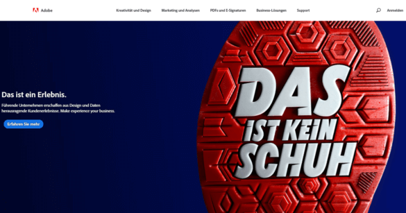
Here is an ideal example from Adobe - Navigation and Hero-Shot together form a good UX
Focus elements instead of sensory overload
Segmented entrances
Interactive alternatives
Accessibility-compliant solutions
Business impact: Companies that replace sliders with hero shots, clear messages, and segmented entries are proven to increase their conversions — often by double-digit percentages. At the same time, bounce rates are falling and legal risks are minimized.
If you want to replace sliders, you should not just rely on gut feeling, but proceed systematically. The key lies in clear hypotheses and clean A/B testing. Instead of blindly incorporating a new design, it's worth making concrete assumptions: Does the click rate on the call-to-action increase when the automatic slider is replaced by a static hero shot? Or does the bounce rate fall if, instead of five changing messages, three segmented entry options are visible?
Backed by such hypotheses, targeted tests can be set up. A comparison of the existing version with slider (variant A) and a clearly structured alternative without slider (variant B) is a good idea. Not only should the conversion rate be measured, but also metrics such as bounce rates or scroll depth in order to record overall user behavior.
Segmentation is also important: Mobile users react much more sensitively to sliders than desktop users, and there are also differences in the perception of clarity and distraction between new customers and existing customers. Anyone who includes these factors in the evaluation receives significantly more robust results.
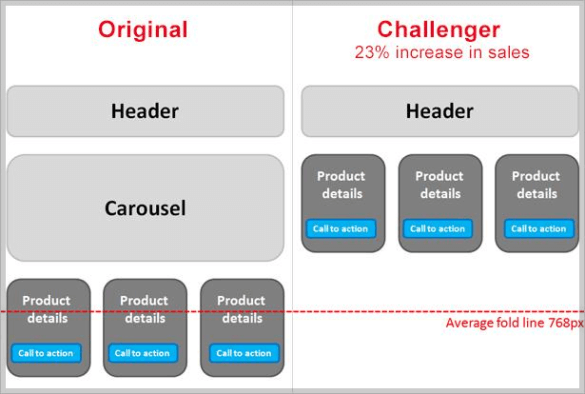
Best practices from practice show how big the impact can be: A financial services provider even achieved a 23% increase in sales by simply removing a slider.
Remove distracting elements to increase visibility and clarity of content
Cross-sector e-commerce studies also confirm: Hero shots and focused entry options almost always beat sliders because they create clarity and do not distract user attention. However, the real added value lies in the process: Anyone who not only replaces sliders but systematically tests alternatives builds a data-driven optimization culture. This makes conversion optimization not a question of taste, but a reliable business lever — and every test provides valuable learnings for further improvements in the funnel.
Sliders are relics of an old web aesthetic. They look dynamic, but they don't deliver clear messages or stable results. Users react with disinterest or frustration, and at the latest with the new accessibility guidelines, they will also become a legal risk.
The better solution lies in simplicity: a strong visual element, a clear message, a comprehensible path to the goal. Those who consistently test and optimize this build trust, reduce abortions and measurably increase the conversion rate.
Companies that focus on clarity rather than distraction benefit twice — through more sales and a user experience that will last in the future.
.png)
