LEAP Summer School: Free CRO course worth €3,000!
Sign up for free

The smartphone has long been the most important touchpoint in the customer journey. But many websites lose conversions here because they are too slow or confusing. The future is: RWD as a basis — supplemented by performance, Core Web Vitals and smart PWAs.
1. Why responsive design remains the standard — and separate m.-domains are obsolete.
2. How Core Web Vitals, UX optimization, and performance contribute directly to conversions
3. Where progressive web apps offer real added value as a strategic add-on.
1. Why responsive design remains the standard — and separate m.-domains are obsolete.
2. How Core Web Vitals, UX optimization, and performance contribute directly to conversions
3. Where progressive web apps offer real added value as a strategic add-on.
Smartphones are now the most important access point to the Internet — for research, purchasing decisions and customer interaction. Over 70% of all conversions start on mobile, desktop is only secondary in many industries. For companies, this means that if you don't offer an excellent mobile website, you lose visibility, trust and revenue.
Google has also created facts a long time ago: With the mobile-first index, only the mobile version of your website counts for rankings. Speed, user-friendliness and clear mobile UX are therefore not just SEO criteria, but direct business levers.
In short: Mobile is no longer an addition, but the basis. The question is not whether You need a mobile website, but How good It is positioned in terms of performance, usability and conversions.
It used to be common to have your own mobile version of a website at a separate URL such as m.domain.de to operate. This concept has long been outdated — and in times of Mobile-First Indexing risky, even.
Since 2021, Google has only rated the mobile version of a website as decisive. This means that anyone who still maintains two versions has to do double work and runs the risk of losing rankings due to faulty canonicals, backlinks or referrals.
The modern solution is clear: a single URL for all devices.
This has several advantages:
For decision makers, this means that anyone who still uses separate versions today is wasting resources and risking performance losses. A consolidated URL structure is the basis for sustainable success in the mobile web.
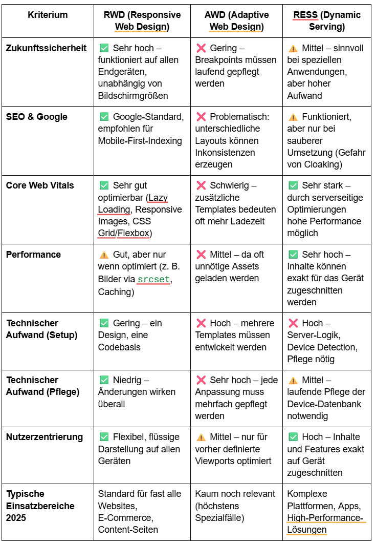
A few years ago there were Responsive web design (RWD), Adaptive Web Design (AWD) and RESS (Responsive Design with Server-Side Components) Hotly debated alternatives. Today it is clear: RWD has established itself as a standard.
RWD means: an HTML code, a CSS layout — but flexibly adaptable to any screen size. Thanks to modern technologies such as CSS Grid, Flexbox and Fluid Typography Today, websites can be designed with high performance for all devices, without additional effort using multiple templates.
State of the art: Almost all professional websites rely on RWD, often supplemented by performance optimizations such as lazy loading, responsive images (srcset) and Core Web Vitals optimization.
AWD works with fixed Breakpoints and provides various layouts for defined screen sizes. This was useful in times of fewer device types, but is now considered outdated.
Issue: Maintenance costs are high, as new device variants have to be considered all the time. AWD can still be useful for complex use cases (e.g. kiosk systems or closed apps), but it is hardly an issue on the web anymore.
RESS combines responsive layout with server-side adjustments. For example, by delivering images in optimized sizes or providing functions depending on the device.
Used today: No longer as a standard, but selectively. Typical areas of application are High-performance websites, Progressive web apps or complex platforms that provide different content or logic for mobile devices. Thanks Client Hints, modern CDNs and edge computing, much of this is now easier than in RESS times.
For decision makers, this means: RWD as a basis, combined with performance optimization (images, load times, Core Web Vitals). Special solutions such as RESS only where they really bring measurable benefits.
2025 is no longer just the question “Responsive or not? ” about the success of a mobile website. Google, users expect today Performance, stability and clear usability.
Die Core Web Vitals Set the bar for mobile websites:
These figures are not only Google search ranking factor, but also decisive for the conversion rate. Slow or unstable sites immediately lose users — especially on mobile devices, where patience is even scarcer.
Mobile UX: Focus on user experience
In addition to pure performance, today the Expectations of mobile users:
Mobile optimization = performance + usability. RWD or RESS are just the foundation. Without optimized Core Web Vitals and a well-thought-out mobile UX, pages won't exist either on Google or among users.
For corporations and large SMEs, a healthy link profile is not a nice-to-have, but a central growth driver: Mobile websites are the basis — but sometimes “just responsive” is not enough. Get right here Progressive Web Apps (PWAs) into the game. They combine the strengths of websites with those of native apps without the need to download them from the app store.
When PWAs are useful:
The benefits at a glance:
Important: PWAs don't replace a mobile website. They are a strategic add-on that is particularly convincing where users return frequently or where quick transactions take place.
For 2025, mobile optimization is no longer an option, but a must. Decision-makers should follow five guidelines:
RWD as standard
Prioritize performance
UX testing
Check PWAs
Continuous optimization
The goal:
A mobile site that not only works, but impresses — with speed, ease of use, and seamless experiences that drive conversions.
A fine mobile-optimized website is no longer a competitive advantage, but the basic requirement for visibility and conversions. Decision-makers must therefore think beyond pure responsiveness: Performance, Core Web Vitals, and User Experience are the levers that determine success or abandonment.
Progressive web apps offer additional potential where users regularly interact or expect quick transactions — they make digital offerings even faster, more convenient and more reliable.
Anyone who establishes RWD as a standard, prioritizes performance, consistently tests UX and uses new technologies such as PWAs in a targeted manner does not just create a functioning mobile website. He creates a mobile-optimized experience, which binds customers, strengthens trust and sustainably increases conversions.
.png)

.png)