€12.4 million in additional revenue through A/B testing!
Watch for free now

Decision architectures have a strong influence on the performance of a website. But how do they come about and how can you influence them? Find out here!
1. How can you guide people to their goals with psychological nudges?
2. Which tools make up a good decision architecture?
3. Which psychological guidelines can reinforce them?
1. How can you guide people to their goals with psychological nudges?
2. Which tools make up a good decision architecture?
3. Which psychological guidelines can reinforce them?
To date, countless lectures, seminars, webinars, books, articles, white papers and comments have been published with tips and tricks on how to optimize a website that (should) lead to an improvement in the conversion rate. Many websites now have benefit communication, social proofs, a Progress bar at check-out and have understood that the company logo belongs in the upper left corner and the shopping cart button in the upper right corner. These measures contribute to the conversion, but they won't result in a turnaround and you won't make the big hit with them. To get the macro conversion out of its rigidity and move it upwards, you need to redesign the website's decision architecture.
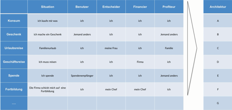
A decision architecture is understood to mean Arrangement of options (autonomous decisions) that are made available to a user while solving a task. It is the factual arrangement of decision nodes at which the user has one or more Options for action has.
For example, someone has the choice between reading a book and going shopping. He chooses to go shopping.
Here, the customer first has the Choosing the supermarket. In the supermarket, he or she can decide which products (product A or product B) he or she puts in his shopping basket. He or she then has the option to go to the checkout or leave the shopping cart and leave the supermarket without shopping.
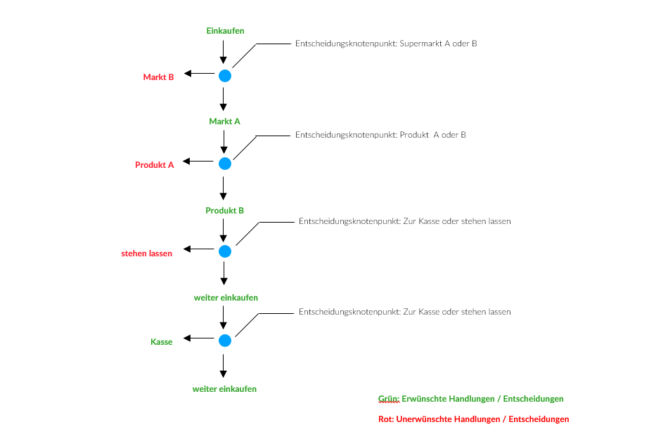
This is how we decide when shopping
When paying for purchases at the cash register, the customer now has the options of paying for his or her purchases with cash, EC card, credit card, a voucher or not even paying at all.
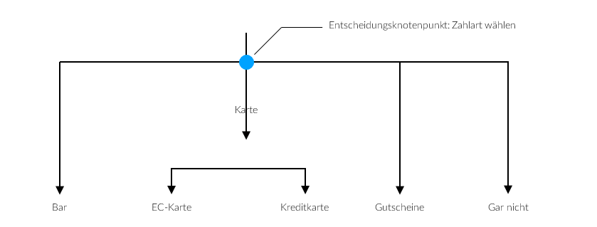
Even when it comes to payment, there are many options
Based on this already very simplified example, you can see how complex a seemingly simple shopping process is and how many individual decisions you have to make in this process.
Decision architectures — as in our purchasing example — are not created in the traditional sense by someone planning, designing and implementing processes on the drawing board. Decision architectures arise not as a concept in a think tank. Rather, they have always been latent. Their existence and structure are revealed to us whenever we follow people and watch them make decisions in a particular situation. Decision architectures are not created. Decision architectures manifest their existence through Actions of people, which are preceded by a decision on an option. They pervade and determine our everyday lives. Decision architectures are a reflection of our actions, thoughts and preferences when tackling tasks and problems that we encounter in our everyday lives.
Each Decision architecture is linked to people, which are in a specific situation and can range in size from a single person to hundreds of millions of people. In our shopping example, there are millions of consumers who want to stock up on consumer goods every day and visit a supermarket to do so. However, it can also be car owners who want to pay for their parking ticket at a parking machine, or passengers on a subway who have to cross a barrier on their way to the platform, customers of a gas station who want to refuel their car, citizens of a district who apply for a new pass or even users of a website who want to buy a product. Depending on the situation and problem, we are dealing with a different group each time and therefore with a completely different decision architecture every time.
Die number of decision nodes and the respective options, as well as the intensity, in which they are selected, give us information about how complex the The process of finding a solution is for humans in each case. Based on people's behavior and the decisions they make at that decision-making hub, we gain insights into the preferences, fears, preferences, and dislikes of those who make decisions. The overall view of a decision architecture gives us information about how people cope with the problem or task, where they are making good progress, where they are threatening to fail and where they are leaving the process.
The ratio of the number of people who entered a decision architecture to the number of those who managed to achieve the goal provides an insight into how effectively this decision architecture works. Further analyses, such as how long it took someone to find a solution, how often he or she had to change direction or strategy, and how exhausting it was to avoid barriers and hurdles, provide an idea of how good or bad (solution-promoting or inhibiting solutions) this decision architecture is. A good decision-making architecture is characterized by the fact that as many people as possible who enter into it achieve the desired goal without much effort achieve when overcoming barriers. That sounds kind of familiar.
What should you do if you now find that a Decision architecture prone to errors and Solution-inhibiting works and only a few people achieve their goal? How should the manager of a supermarket act when he finds that crowds of people are flocking to his supermarket but only a few come out with purchases? Everything you need is there: A large parking lot, a wide entrance, tons of shopping carts, all products, discounts, advertising, sellers, many cash registers, all possible payment methods and a wide exit.
The market manager starts Behavior of his or her customers toward observing and realizes that they leave the supermarket through the supplier exit without completing their purchase. The decision architecture was changed by customer behavior and now looks as follows.
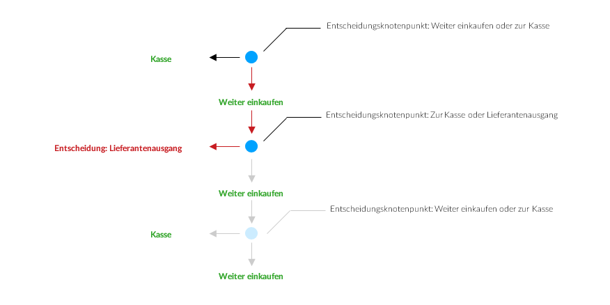
There is a new branch
What now? The market manager could simply block outgoing suppliers. According to the assumption, customers could only leave the market via the cash registers. But that would have serious consequences. First, he or she could no longer accept goods. Second, the closure would violate safety regulations. Third, when customers saw a barricaded door, they would feel constricted, controlled, patronized in their freedom of movement and would not come back again. It is therefore not a true option to block outgoing suppliers. Outgoing suppliers must remain open and accessible.
Let's look from the analysts' perspective. But what is the market manager planning with regard to the decision architecture? By blocking outgoing suppliers, the market manager wants to intervene in the decision architecture and remove the decision hub “Checkout or Select Outgoing Supplier.” What would the decision architecture look like after the procedure?
You can't just close the exit
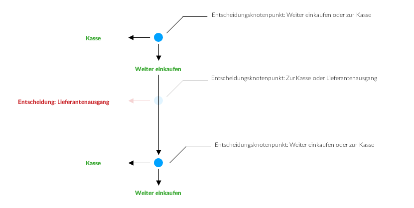
The logic is that by removing the decision hub from the decision architecture, the customer no longer has the option to be able to leave the market here prematurely. Without this option, the customer will either go to the checkout or continue shopping, according to his or her calculation.
However, the market manager will not be successful with this. As we know, decision architectures are a reflection of our actions, thinking and preferences when tackling tasks and problems that we encounter in our everyday lives. Nobody but people creates decision architectures and no one else can change them. Decision architectures change as we act, think, and preferences change. A market manager has almost no influence on them and therefore it is not possible to restructure decision architectures by “higher authorities”.
In other words, if the market manager blocks the supplier exit, the customer will find another way to find the market past the cash registers. But how can he get his customers to continue shopping and end up paying at the cash register? To do this, you have to use a method that ensures that customers don't even Needs feel like using incoming suppliers and, in the best case, even ignore it.
For the online shop, this means that it makes no sense to withdraw the user's usual options for action — such as the back button — in order to force him or her to take the desired action (decision). The user feels a loss of control and jumps off. It is much smarter to leave the context as it is and to guide the user through the funnel without him feeling guided or even controlled. Now we know that people usually navigate through a website with the intuitive and sometimes irrational System 1, usually get off the “optimal click path” and end up somewhere completely different from where the operator or the owner of the website actually wanted them.
The trick is to provide the user with an “invisible and imperceptible” decision-making aid at critical points (decision nodes) in the funnel in order to support him or her in the decision-making process without incapacitating him or her.
In her book”Nudge“Do Richard Thaler (Nobel Prize for Economics in 2017) and Cass Sunstein address the question: How can you help people who are in complex decision-making architectures to make a good and, above all, correct decision that contributes to their prosperity, satisfaction and happiness? And that without restricting, patronizing or manipulating him? Such complex and sometimes socially important decisions include, for example, choosing an optimal retirement plan or deciding whether you want to be an organ donor or not.
The answer that Thaler and Sunstein provide is “nudging” (prodding). In recent decades, psychologists have investigated the behavior of people in certain situations and have come to the conclusion that people in certain decision-making situations have the same patterns of behavior and reaction regardless of their socialization, nationality and intelligence — evidence of the existence of system 1. Psychological patterns of behavior describe the connection between a cause (trigger) and their effect (Behavior).
If a man's urinal is fitted with a fly sticker (trigger), 99% of all men will try to hit this fly (behavior). As a result, nothing goes wrong anymore.
If you place products on shelves within easy reach at eye level (trigger), consumers are more likely to add them to the shopping cart than products that are on higher or lower shelves (behavior) because consumers shy away from physical effort.
If printers are delivered with the standard setting “double-sided printing” (trigger), this default (behavior) usually remains the same because users are too slow to study the user manual to change the configuration.
The tremendous power of psychological behavior patterns lies on the one hand in the stable and lasting consistency between the trigger and the behavior, but above all in the fact that they allow a reverse conclusion. This means that you can't just infer a behavior from the trigger and thus Predict can how a user will behave under certain conditions, but can also draw conclusions from observed behavior as to what triggered this behavior.
Greatly simplified:
If a form contains 17 mandatory fields (cause), a great many users will not fill it out and will be more likely to jump off (effect.)
Reverse:
If many users do not fill out a form and jump off (effect), then it is probably because it contains too many mandatory fields (cause).
Nudging goes one step further and postulates the following statement: If you want to trigger a certain behavior in people and you understand the connection between cause (trigger) and effect (behavior) of a specific pattern of behavior knows, then you know exactly which trigger you can use to stimulate/trigger this particular behavior.
When nudging, you make yourself familiar Cause-effect relationships use human behavior patterns.
If you want to achieve a certain behavior in people or bring about a certain decision (effect), you have to put people in a known pattern of behavior prod and trigger the cause that the decision-making process towards a desired results steers.
If you turn the above behavioral patterns into a nudging strategy If the following approaches would be adopted:
If you want to reduce “scattering effects” when using men's urinals and thus cleaning costs, you should equip urinals with a fly sticker.
If you want children to consume fruit and vegetables at school rather than donuts and chocolate bars, you should place fruit and vegetables on shelves at eye level and within easy reach for children.
If you want fewer trees to be cut down for paper production and save companies money, all printers should be delivered with the default “double-sided printing”.
If you want a form to be filled out and the cancellation rate reduced, you have to reduce the number of mandatory fields.
The examples given here are all nudges. They do not prohibit, impose, dictate and do not restrict freedom of choice. You don't see it, you don't feel it, you don't hear it. They give people the choice to decide otherwise, if necessary.
Her power lies in the fact that she acts as invisible psychological guardrails can be used in decision-making processes that steer people towards decisions and behaviours that would not have occurred without them.
You don't feel nudges and at no time do you have the feeling of paternalism or loss of control. Nudges help the user about a decision that the user looks back on with satisfaction and of which he or she is aware that this decision or decision sequence was free from external influences and was made autonomously. This makes everyone involved feel good about the decision they have made.
But what does that look like in practice? To illustrate this, we present the six most important frameworks for decision architectures in more detail below.
1. Defaults
The default is an extremely strong nudge. It is rarely or barely changed, as people...
People usually think that the default will make sense, as someone must have thought of something when creating it. When social proof is added, it can have its full effect.
Defaults are a powerful weapon, especially when it comes to donations. In the example below, WWF has set a default sum. This default setting will result in the average of donations made being significantly shifted towards the default of 75€. Visitors who wanted to donate between 50€ and 100€ anyway feel confirmed and are relieved of a decision. Those who actually only wanted to donate €10 are “pulled” to a higher amount due to the “anchor effect” — here, the default and anchor effect play off each other.
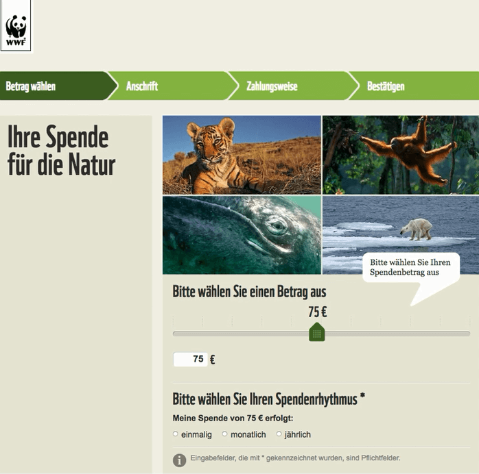
WWF defaults
2. Failure anticipation
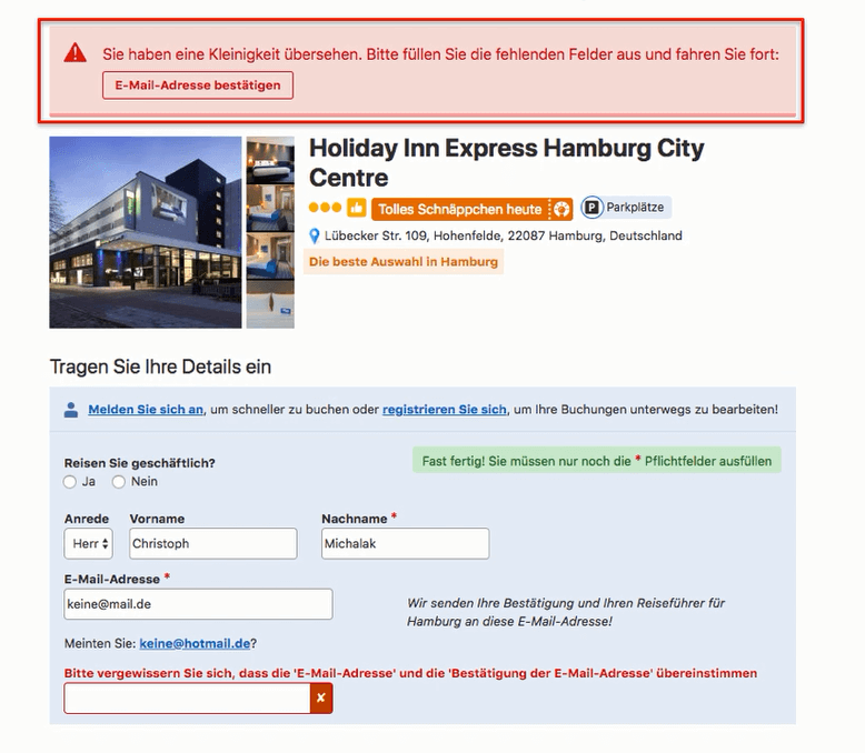
With this tool, you can significantly reduce your abandonment rates. Where mistakes can be made, they are also made. Think about — or even better: Test in a small group — what users stumble upon or where they could make a mistake. Then secure these places against these same errors. A good example of this is Figure 2. As a rule, the “Send” or “OK” button is always at the bottom right. If you now install the “Close” button at the bottom right, as in the following example, many users will unintentionally close your form because they think they have clicked the “OK” button. That's when they wonder why they're not getting confirmation. You, on the other hand, will be surprised why so many users cancel after they have already completed the form completely and without errors.
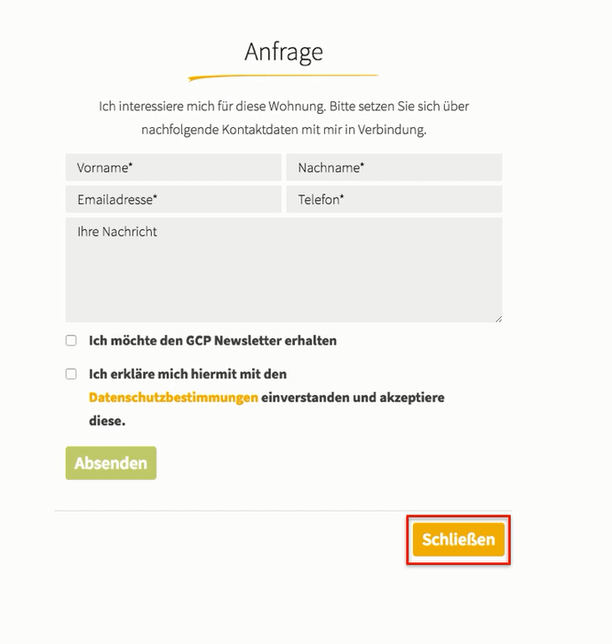
Don't violate learned behaviors
Another aspect of error anticipation is planning for fault tolerance. For example, if you're selling flights, the website should accept spelling mistakes like “Munich” instead of “Munich.” It is also nice if you give the user suggestions while typing using Autosuggest.
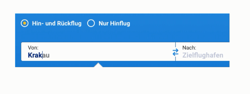
With this input help, you make things easier for your users
Don't forget to also allow possible international names. In the example above, “Munich” or “Krakow” should therefore also produce valid results. Everything else is further forced mental decision-making processes that bring the sluggish and energy-consuming System 2 to the scene and place unnecessary stress on the user.
3rd feedback
When you sell something, your website replaces the salesperson who can help the customer in a brick-and-mortar store. But it has a decisive disadvantage: the emotional world. She cannot see, taste, feel or smell like the salesperson. However, it can react to the customer's actions and give him feedback. This applies, for example, to a search function. Because if you're looking for a specific product, you want to buy it in the vast majority of cases. In this context, interactive forms, for example, come into play again on registration pages, which confirm the user's actions through cheering.
Another example of constructive, conversion-boosting feedback on pages is online validation of forms. Tell your users directly when they've done something wrong and also tell them how it must be right. Then they can correct their mistakes without much effort.
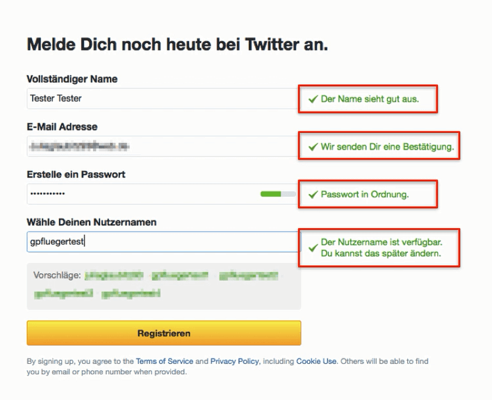
The login “talks” to the user and gives him positive feedback
Clear, understandable and easy-to-understand error messages are also important. As is often the case in life, negative feedback can help us move forward much better than positive feedback. There is nothing better than a personal approach.
Here, the user feels directly addressed personally
4th mapping
Mapping is the solution for a highly complex comparison process in which the user must weigh up the benefits of his or her decision based on the resulting implications.
A suitable example is the mobile phone plan, which gives you the following options:
This example alone contains more than 30 different combinations, which differ in terms of costs and services. No one makes the effort to compare them all with each other in order to come to a “good” decision for themselves. The uncertainty of making the wrong decision with long-term consequences means that the user makes no decision and you lose both the customer and the referral commission.
The solution is to offer the user the decision variable as a comparative measure. Offer him or her the value or parameter that triggers the decision as a comparative variable between the options. In the smartphone example, the monthly costs that the user ultimately has to pay trigger the decision. Take over this complex comparison process for your users and tell them how much they have to pay monthly after all the above parameters have been calculated over the selected term. In this way, several homogeneous parameters (activation fee, monthly base price, bonus...) can be broken down to a single comparable number based on the same unit (€).
At first glance, the left-wing tariff seems cheaper, but...
The site does the mapping for the user and provides him with a single comparative figure (total monthly price), which makes the decision easier and corrects an alleged wrong decision, meaning that nudging fully fulfills its role.
5. unbundling
The unbundling of complex decision-making processes is always necessary when the optimal choice consists of several inhomogeneous components (distance (km), price (€), area (m2), duration (time)) that are not available or can only be obtained with great effort. Several aspects should therefore be evaporated in such a way that the user can make a good decision.
This works on booking sites, for example, by using filters. According to Amon Tversky (1972), the “Elimination-by-Aspects” rule then appliesl, which, by constantly excluding all available options, narrows down to those that really suit the user's wishes.
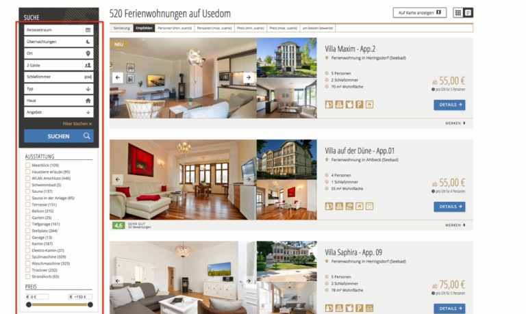
All apartments that do not meet the requirements are gradually flying out here
You can also use this tool in conjunction with error prevention. For example, if a user selects a departure airport, you can show him or her which destinations are actually being served from there.
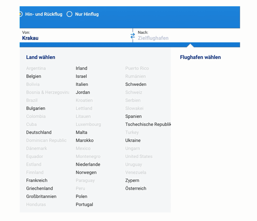
Nobody here will be annoyed afterwards that the search did not play off an airport in Brazil
6. Incentives
Incentives only lead to decisions or transactions if the operator of a website can answer the following questions with regard to his or her offer:
Who is being addressed?
Architecture A just needs to be designed for you. For everyone else, however, other parties come into play, which must be considered at one point or another. The website will only be successful if everyone involved is picked up.
But sure! A good example is Booking.com.
It starts with the start page. Here you will find neither benefit communication nor social proof. The only option is to get straight into the funnel and say: “I want to go from then until then.”
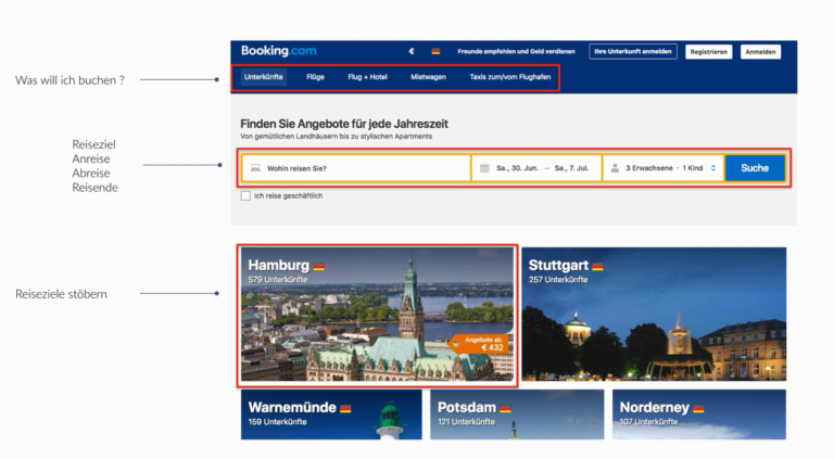
Here it starts for now
If you want to register, errors are anticipated and feedback is given.
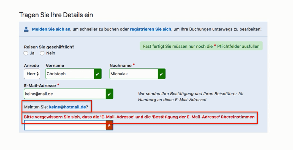
Anyone who makes a mistake here is immediately pointed out
Anyone who comes to the selection page immediately receives some default information, which should make booking easier.
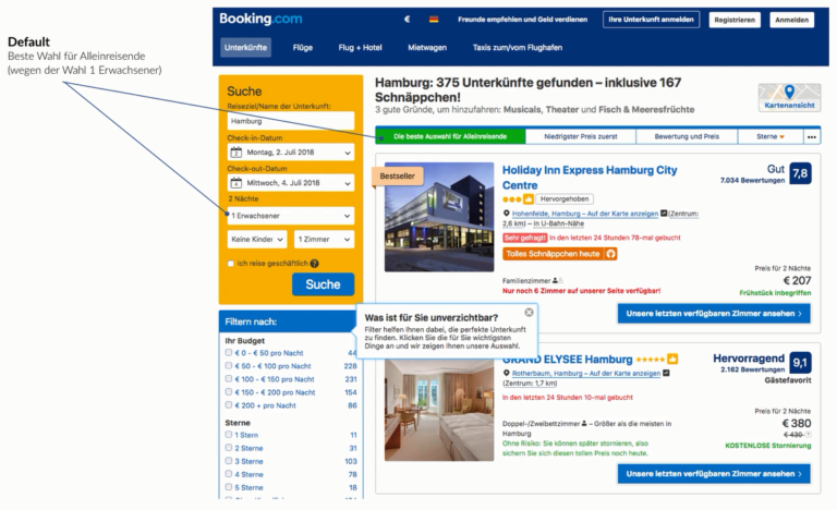
The default is a perfect match for the offers
The prices are calculated for different rooms but for the same booking period of 2 nights and are therefore easier to compare. The decision size is equal to the comparative figure — in this case, the costs for two nights. Mapping in perfection, in other words.
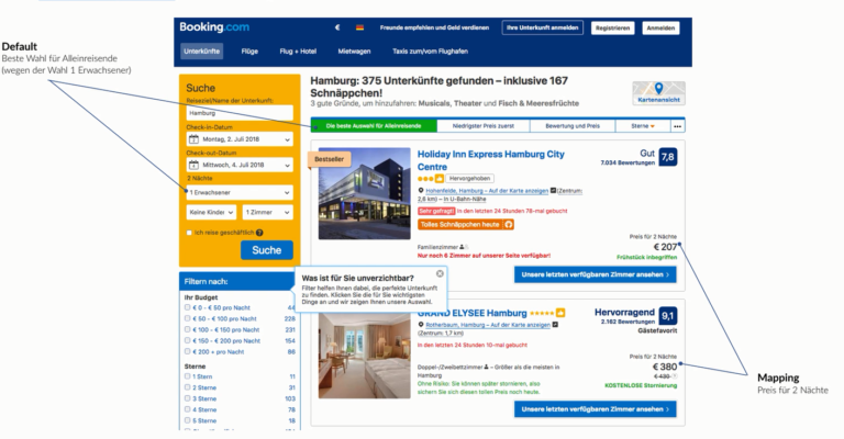
So there are no hidden costs
There are a few basic filters that can be added further below for unbundling — if desired. And social proof is also part of the unbundling. Because anyone who doesn't know what to do is usually follow the crowd first.
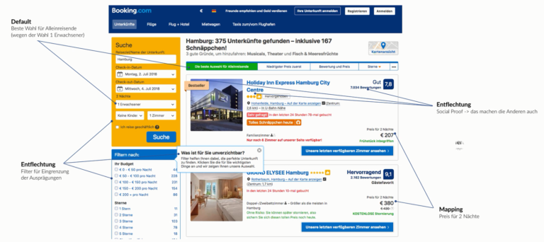
Unbundling makes the decision easier
In addition, numerous incentives are being set, which attract several user groups.
.png)
Sightseeing and location as good reasons for booking
And last but not least, a psychological guardrail is also set: A shortage triggers loss aversion.
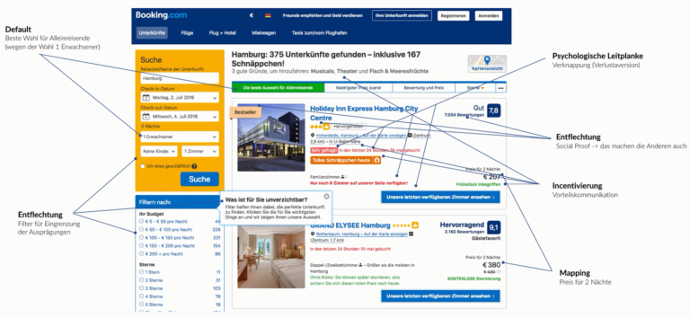
Sightseeing and location as good reasons for booking
Your websites must make it easy for visitors to reach their (and yours) goal: conversion. With the right decision architecture and the right nudges, you can guide them to their destination in a relaxed manner.
Websites therefore deliver a high conversion rate if they offer a decision architecture tailored to the user and his or her situation and this reinforce with psychological guidelines.
Disadvantages of Adaptive Web Design include:
Note: When choosing between a responsive or adaptive design, you should ask yourself whether other information is more important or features are better for the user on mobile devices than on desktop devices. If this is the case, an adaptive layout or the following technology is recommended, as these methods are the only way to influence the content and its presentation on different devices.
Responsive Web Design and Server Site Components is virtually a hybrid solution from the other two variants RWD and AWD. The basis is a responsive design, which is supplemented by adaptive — server-side — components. Certain processes are taken over by the server and thus relieves the browser. These server-side components represent client-server communication, which reflects the specific characteristics of the terminal device using a device database determines and exchanges it with the server.
A common use case from RESS is the use of adaptive images in a responsive design. In this way, images of various sizes and resolutions are saved. Depending on which device accesses a page, the server selects the most appropriate image for that device. This means that when the page is accessed via a smartphone, a smaller image is output than when accessed via a desktop PC. This not only saves you time, but also data volume and the user doesn't notice any visual difference.
Die benefits From RESS are:
Disadvantages of this method include:
Depends on the device — the User Agent — a different code is sent Depending on which device requests the page, the server transmits the appropriate device-specific HTML, CSS, and JS code. Since the code depends on the device being used, the Vary HTTP header must be set to User Agent so that the server is told which resources should be sent to which device. This method, when different code is sent at the same URL, is also called dynamic serving.
.png)

.jpg)
AI traffic is still low, but converts significantly better. Users are pre-qualified, making conversion even more important than traffic.

Digital voice assistants are changing the way customers search for products and services.

Anyone who only thinks of colorful game features when it comes to “Gamification” is vastly underestimating its potential.

Today, seconds determine turnover or bounce. Sites that load too slowly lose visibility, conversions, and trust.

When it comes to international SEO, many companies quickly reach their limits. Because running a website in multiple languages is only half the battle.